Wednesday, July 4, 2007

This is a test post

I'm making layout for another blog, since this is now abandoned, I'll use it as a test place for my new layouts.


Lorem ipsum dolor sit amet, consectetuer adipiscing elit. Morbi pretium neque. Nullam eu nibh et eros pretium euismod. Nam aliquam, erat et bibendum elementum, massa metus vestibulum dui, id mollis odio ante nec nibh. Maecenas laoreet. Aenean a dui. Fusce fringilla bibendum libero. Nam suscipit volutpat enim. Morbi mi purus, aliquet vel, laoreet a, convallis a, ligula. Proin diam turpis, laoreet non, tincidunt at, condimentum tincidunt, lorem. Sed tincidunt, nibh non sagittis bibendum, dolor erat ultrices ipsum, at tempus neque leo ut lacus. Nullam sollicitudin aliquam leo. Vivamus sagittis nisl in quam. Maecenas ornare, nisi a dictum tincidunt, arcu erat tempus elit, non rutrum est velit eu tortor. Proin diam. Nam porttitor dapibus magna.


University
Lucky


blockquote {
margin: 0 0 0 30px;
padding: 10px 0 0 20px;
font-size: 88%;
border: thin solid #66ccff;
color: #66ccff;
background: url(http://i30.photobucket.com/albums/c345/Adamaru/quote.gif)#e1effg no-repeat top left;
}

Monday, May 21, 2007

draw - whale and the moon

Whale and the moon
Source: http://www.deviantart.com/deviation/30069694/

What makes me love this picture was its color. There is mostly blue, many shades of blue, but all the light and details are very clear. I love monotone color and admire people who can mix one color so brilliantly to create picture proper details.
The feeling is pretty sad to me, yet very romantic. There was no story or explanation for the picture, the author leave the work to the viewer's imaginary. People think the whale was obsessed with the moon and in its birthday, it was granted a wish to travel on land and look at the moon clearly. The whale is really cute and it somehow looks curious. Very fairy-tail like picture.
This image actually inspire me a lot in creating background for my flash, which has all backgrounds in shades of blue.

photo - heartless

Heartless
Source: http://www.deviantart.com/deviation/40870674/

The photo caught my attention at first glance and honestly, I didn't realize that this is purely a photograph, the heart is formed completely by adjusting lighting and depth of field.
The concept of this image isn't new and the author even said that. However, I was really fond of the photo, probably due to my lack of knowledge about the concept (that a heart could be made from a circular object) and my own reference when I saw the photo.
This image gave me a a sad feeling. The light was cold and there is a lonely ring, forming a heart. I thought this could be the feeling of someone who is abandoned, left with a ring of memory and continues remembering his/her love.

Monday, April 2, 2007

My business card

Photo Sharing and Video Hosting at Photobucket

This is my business card, I made it to practice the lesson in class.
I wanted to use more color, however, after trying so many other things, I came back with black again. Probably because I originally created my logo with B&W. Besides, only with black background can I feel the contrast that can make my symbol noticing. (I think I should try some effect to make with a bit glossy, this is kind of bland. I will improve it later)

There is nothing much to say about the design. About the color, I already explain above. Another thing I want to say is the curve that divides the card. I want to use my logo in this card and I realize it cannot stand it front of any text (because I can't make my name too big and if the logo is too small, it leave no impression), so I leave a space for the logo exclusively. I used curve to divide the card to make it have a more flexible look (not just a straight line like other cards for business men). I put the logo on top-left and the area with lots of text on right-bottom to archive balance, dunno if it's successful ^^"

Finally, the space below the logo is too blank, so I left a small signature there.

Photo - Fun reflection


I find this image is really funny and attractive. We already knew about reflection in class and I have enjoyed many photo from my friend's blogs too. However, this image impressed me more than any reflection photo I have seen because the reflections complete the images.

With the reflection, I can see the jaw wide open and ready to swallow the fish. I have tried cover half of the image and I can clearly feel the difference. Without reflection, I kind of feel like it isn't an open jaw anymore. This reflection works even better with the fish. When I looked at the photo a little further away, I can see all the fishes make a another larger fish, very stunning.


We can easily see the reflection here is manipulated but that's why it is eye-catching. The concept of this image is "Now. A moment or period in time perceptible as intermediate between past and future" (from Ahermin)

To me, people always longing to past or future and sometimes forget the present they are in. This image remind me of this thought. The man running forward, like people think about future and in the reflection, it's like people wanting to turn back to the past. The past and the reflection, very nice combination. It presents the idea so straight forward and impressive.

The way he reverse the reflection but still put the man standing the same place creates a fixed point, the joint between the 2 worlds, just like Now is between past and future. I really love this image for its meaning and composition.

Photo - Promenade

Photo Sharing and Video Hosting at Photobucket


This is a photograph created by Ahermin. A lovely image with nice color and rhythm. Here in this photo, all the shadows are captured nicely, especially the trees and the bird. I thought this is a painting (because there is no one in the cars, so I was surprised to know this is a photograph).

I love the concept of the photo. The image of cars lining up on the streets is quite a frequent image we can see today. This photo, capture the same scene, all cars lining up, just except this is their shadows, a refreshing perspective of the everyday! Many of us forget to approach what we see in different ways... like this (including me ^^).

This is great piece combining Humour + Creativity + Fantasy.

Vector art - Cliffhanger

Photo Sharing and Video Hosting at Photobucket

Cliffhanger by Leigh-thebault
http://www.deviantart.com/deviation/31975858/

A very beautiful vector art, both the concept and the design is nice.

Maybe we all can see the idea of this image, " in life there is always a balance of good and bad and that although theres always happyness and laughter theres always pain and sorrow somewhere else and vice versa" (original explanation from Leigh-thebault)

The concept of love and departure is depicted very clearly with the contrasting images of a hanging man and a couple. This image impressed (or even shocked me) when I first looked at it.

I also like the scenery of the image, this is a mix-genre art. The moon and the atmosphere create a fantasy look, very romantic and bright. Yet, the tree, the cliff and people is in complete black (which is frequently seen in vector art). I think this is another use of contrast (but this time, in color) and it make the image become more attractive.

To me, this image is disturbing, interesting and charming all at the same time.

Saturday, March 17, 2007

My favorite Fractal Art images

The first time I saw Fractal Art images was 2 years ago and I was fascinated by them at first sight. I love Fractal Art for its beauty and complexity. There’re a lot of fractal art galleries out there, but the greatest place to enjoy them is still Deviant Art (I think). I’m glad I first saw them at DA because when I search fractal art with Google, I hardly found any work as beautiful as the ones in DA.

Fractal art images are complex computer generated images or designs of amazing detail. There’re many free programs to generate them (but it’s not easy to imagine and make setting for these programs to get the beautiful images). After looking at many fractal art images, I realized that most of my favorites is created by Apophysis program. I chose 3 of my favorites with 3 different styles to talk about here. As I said, what are so great about these images are their details, so please look at the full size image if you have time (just click on the image for its original site and click Full view button).

Note: The “styles” I’m talking about is just what I defined myself to categorize what I like and what I want to make in the future ^^

Beyond by Ab1lity
Beyond by Ab1lity

I found this style (with fractal flames) is the most popular. I personally like this image the most in this style for its great depth and pleasant color. When I look at this one, it seems like I’m passing through an icy vein. This image also has good balance in the dark and bright space, so it doesn’t look too busy like some other images in the same style.

Into The Blue by_Ab1lity
Into The Blue by Ab1lity
Source:
http://www.deviantart.com/deviation/50852382/

I’m absolutely in love with this one and I’ve spent almost 30 minutes to look at it and admired the artist. The idea of symmetry is obvious and many fractal art pieces create their beauty with symmetry too. This image has gorgeous jewelry details, very complex yet clear. To me, it also has superb color combination, grey-black with white-blue. The main details really stand out by using different color from the background (oh, it’s dominance ^^), the colors are pleasant (not to mention they’re all my favorite colors). In general, this belongs to the style where artists use many circular shapes and symmetry. I myself like symmetry too, so I love this style the most.

An Ancient Message by banana_tree
An Ancient Message by banana tree
Source:
http://www.deviantart.com/deviation/49318963

This one is what I’ve just found recently, it hasn’t been really popular yet but I think it’s beautiful too. The gradients, shapes, and colors are all in perfect harmony. I really love the marble gradient; it looks like an old, Greek mosaic (I love mosaic ever since I watched the anime Gankutsuo – The count of Monte Cristo). The lines and shapes are strong and clear. I think what makes it different from other style is the firm look instead of fantasy and flexible look. And finally, I love its rhythm composition.

Thursday, March 15, 2007

Dance with me

Photo Sharing and Video Hosting at Photobucket

This is my new drawing, using pen tool and outer glow effect of photoshop. What do you see in this image? A flower or a butterfly ? Actually, it is both. I'm trying to practice drawing something abstract (just a bit ^^)

I got the inspiration for this image from the tutorial of creating magical light for Dark art (which I used to create the roots). Because I love to see those glowing light so much, I got carried away and wanted to draw something else with the effect. Those light I drew accidentally looked like roots to me, so I thought about a flower to go with it. When I have flower, it looked like it was dancing so I thought I would give it a partner and added some details to make it a butterfly too. (Buterfly and flower is like a couple to me ^^)

The name came in the end, just describing what I see in the image I create randomly. I love this image because it is created with such a simple technique and still look lovely ( or at least I think so ^^)

Tuesday, March 13, 2007

Miserable Soul

Credit:
Image manipulating:
Khanh Mai (nick Deviantart: Adamaru)

Model :
[Link]

Background :
causticstock
[Link 1] [Link 2]

Texture :
mex-stock
[Link]

Brush :
kittyd-stock
[Link]

Roots :
winterdove in sxc.hu
// [Link]

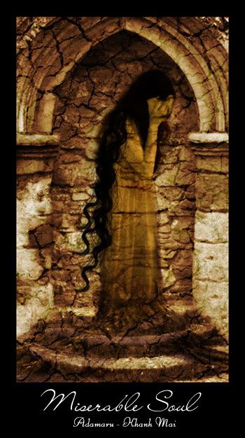
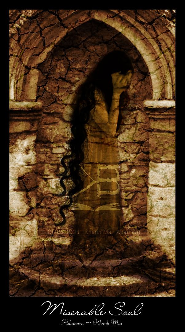
Finally finished my first photo manipulation (manips) work, I've spent 1 day to finalize the idea and another day to find stock images and 4 hours to complete the images. The original size of this image is 1375 x 2500 px, so of course I can't post it here. The small version above is the only one without water mark. You can click HERE for larger version but I've put watermark in it. I also used this image in my DA account.

I've always wanted to practice manips as it is what makes Photoshop so interesting. However, I usually lacked patience to complete the pieces ^^" I want to talk about the technical stuff used to make this image, but I'll leave it in some later post. This post will be about my inspiration for this work ^^

Let's see. I usually looked at a lot of other people's work of photo manipulation in DeviantArt and what always makes me fascinated is how they combine human body with other things like fish-tail (for mermaid), horses, spiders… I want to try something like that too. However, I’m currently unable to re-draw or paint hair and body well while combination with animals usually requires such techniques. Therefore, the first reason I choose roots and soil is because it’s easier and faster to combine them. At the beginning, I want to make something romantic or look-like fairy tales because I've read some romantic novels recently. I thought about a princess who was cursed and turned into stone/tree. I imagined her standing in a forest in winter or something... However, it seems like I’m not good with romantic stuff so the image in my mind kept missing and I cannot complete the idea.

I decided to think about sth more mysterious and dark. I remembered a story that I read some days ago about a woman whose soul is trapped in hell forever because she committed a sin, and I think if someone turn into stone/tree, it looks like a punishment too, maybe I can create someone with miserable fate or look. I just continued with the thought and go find images of roots and woman. Next, I thought about background. Sin & Punishment usually remind me of an old, mysterious, dark and somewhat holy image, so I searched for things that can be used as a temple or sth like that. When I bumped into the image "The Door to nowhere” by CausticStock, I could imagine the rest of the picture and I just began to work with it.

Some of my friends who saw me doing this work will clearly see what I planned at the beginning at the result is quite different, I can't help it ^^;;; Now, we can hardly see the roots (even though i made her turn into tree at the beginning). I also made her hair longer and darker because if not, her head becomes too bland/flat. To make her blend better with background, I made her somehow transparent and look like a soul ^^"

I'm still a very newbie in manipulating photo, so this might be so simple and crappy (I didn't draw anything either). Moreover, to be honest, I made this for the sake of practicing Photoshop skills, not expressing any concept or design principles, so they are just feeling and imaginary that makes me create something like this. But I hope you'll like it ^^